On Thursday, 5 March 2020, Google’s Developer Advocate, John Mueller published an article to the Google Webmaster Central Blog declaring mobile-first indexing will be rolled out for all websites as of September 2020.
“It’s been a few years now that Google started working on mobile-first indexing — Google’s crawling of the web using a smartphone Googlebot. From our analysis, most sites shown in search results are good to go for mobile-first indexing, and 70% of those shown in our search results have already shifted over. To simplify, we’ll be switching to mobile-first indexing for all websites starting September 2020. In the meantime, we’ll continue moving sites to mobile-first indexing when our systems recognise that they’re ready.”
What does this mean? Essentially, if your website has mobile responsiveness issues, Google won’t be able to index your website. Still lost? Let us explain.
Photo by ROBIN WORRALL on Unsplash
The Most Frequently Asked Questions About Mobile-First Indexing
What is Google indexing?
For a web page to appear in any search results on Google, it must first be indexed. To do this, Google sends a bot (known as a Googlebot) to crawl your website, using links within it to find all the relevant pages. They then store the content of the page and take note of key signals on the page to help you appear in searches relevant to your website.
Of course, you can also mark a page on your website with a no-index tag, which tells Google you do not want that page to appear in their search results.
What is Google’s mobile-first indexing?
The Google mobile-first indexing process simply means Google will crawl the mobile version of your website before your desktop version. However, this is a massive issue for many…
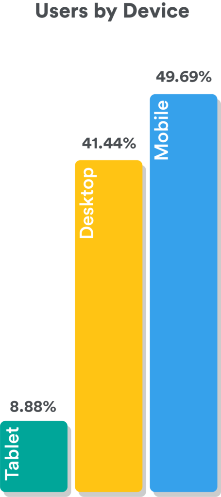
In 2019, Localsearch saw 58.57% of all traffic to websites they built came from people using a tablet or mobile device. This means people are officially using mobile devices to search online rather than their desktop computers.
Google also knows this, and they know the figures for mobile users are only rising. The problem is, if a website is not built for mobile users (known as a mobile-responsive website), it causes issues for the user. This causes users to leave websites faster, which when enough people do this, it shows Google your website is not helpful, and they will place your website lower in search results.
As this issue was increasing with the higher use of mobile devices, Google started to index websites based on the mobile version of their website first, not their desktop version.
What happens if you don’t have a mobile-responsive website?
Right now, Google may use your desktop version to index your website. However, this means you will have to act now to ensure your website is ready for mobile-first indexing in September.
To ensure you’re ready, you’ll either need to fix all mobile-first errors that appear in Google Search Console for your website, or build a new mobile-version or mobile-responsive website. With the amount of errors you’re likely to have, the new website will be your most time and cost-effective option.
Will not having a mobile website impact my small business?
Come September, what will most likely happen is Google will still crawl websites without a mobile version, but those with a mobile version will be prioritised. This means if your competitors have made the necessary investment, they are probably going to be above you in search results, along with a lot of other people.
Now, you may be able to use Google Ads to get in front of more people or social media marketing to get traffic to your website, but you’ll still have a problem. Mobile users will still land on your website and be having issues. Honestly, in the long run, you’re better off investing in a new website now and saving yourself the stress.
If finances are a concern, Localsearch offers a 10-month payment plan for all website builds.
Top 5 Things that Make a Good Mobile Website
1. Fast page speeds.
Desktop or mobile, any version of your website a user lands on should be fast. This is even more important for mobile users as they’re likely on the go and different information then and there.
To increase your page speed:
- Subscribe to local hosting.
- Optimise your images (see below).
- Minimise use of unnecessary code.
- Reduce your use of redirects.
- Use a compression plugin.
- Utilise browser caching.
2. Optimise images.
Every single image you put on your website, you should be resizing, checking the file type of, naming and adding alt text for. All of this together will help reduce its size and utilise accessibility features on phones, if they’re being used.
Resizing images can be tricky as you want to ensure the image is still big enough that users can see all the details, but small enough to keep the file size low. The best thing to do is use the measurements for each block on the website (for example, 650px by 300px). Then, choose the right file type, i.e. .jpg for the majority of images or .png for transparent images.
Once you’re ready to upload, name your file exactly what it is in the image, separating the words with hyphens (for example, Knox-Plumbing-Team). By naming your image, it’s easier for you to find and Google can see what the file is called also.
When you’ve uploaded your image, there should be a box in the image options to allow you to add alt text, which allows technology used by people with vision impairments to have the contents of a page read out. This also helps Google, again, know what the contents of the image is and use it for indexing the image itself.
You’ll also want to ensure these images or any other media do not run off the screen when viewed on different types of devices. A quality assurance tester can check this for you.
3. Write content for mobile.
Mobile and tablet screens are obviously a lot smaller than desktop screens. When you create your content for your website, ensure you test your headings and text blocks on all types of devices.
By testing your text, you’ll be able to see if your headings, text and call to actions can be read without scrolling. This is even more crucial for the information people see the second they land on your website, known as above-the-fold content. The less people need to move around on your website to find what they need, the more likely they are to convert.
4. Build forms, buttons and features for mobile.
Every feature you see on your desktop website will need to be rebuilt for mobile devices. This is due to the sizing and functionality of these all being different.
For example, a ‘Call Us Now’ button that links the person directly to a call action would not work on desktop. Or, an enquiry form that fits on a computer screen will be too big for a mobile screen, causing the user to not be able to enter certain data.
5. Create for all mobile types.
Almost every mobile device has different screen sizes and functionality. Due to this, even once you’ve built your mobile website, you’ll need to have it tested on all different types of devices and browsers.
Still have questions about Google’s mobile-first indexing process? We’d be happy to help. Contact us now and we can provide a free website analysis to see where you stand.