
Prepare your business for the new financial year with this practical guide for Australian local businesses. From finances to marketing, get ready for a smoother year ahead.
Prepare your business for the new financial year with this practical guide for Australian local businesses. From finances to marketing, get ready for a smoother year ahead.

Find out what Labor’s 2025 election win means for your business. From more support for tradies to funding for skills and training, these changes could bring real benefits for local business owners.

LocalRank is a simple, effective local SEO service designed to help small and medium businesses rank higher on Google, drive more website traffic, and connect with more local customers—especially in today’s AI-powered search environment.
Prepare your business for the new financial year with this practical guide for Australian local businesses. From finances to marketing, get ready for a smoother year ahead.
Find out what Labor’s 2025 election win means for your business. From more support for tradies to funding for skills and training, these changes could bring real benefits for local business owners.
LocalRank is a simple, effective local SEO service designed to help small and medium businesses rank higher on Google, drive more website traffic, and connect with more local customers—especially in today’s AI-powered search environment.
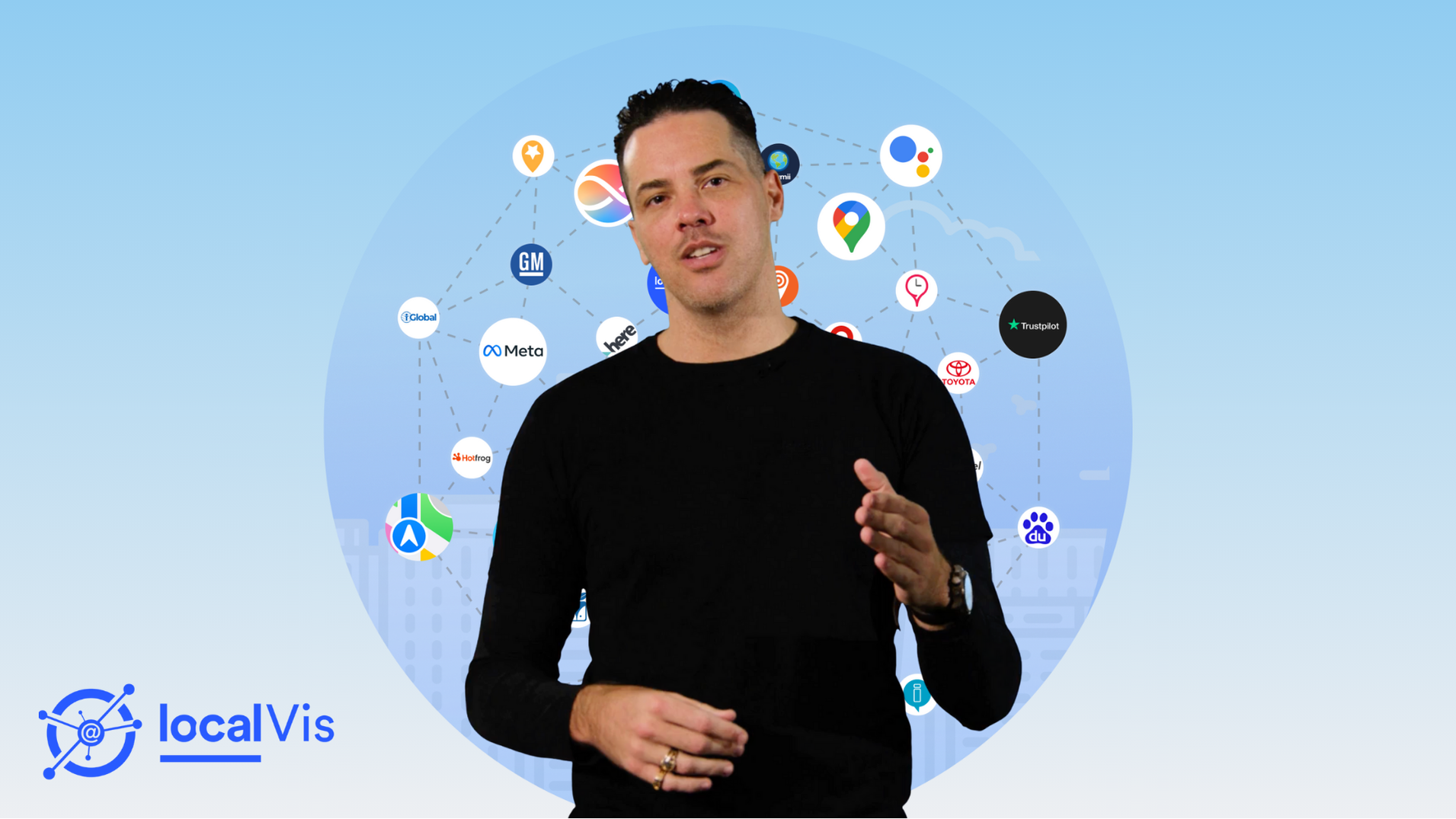
Looking to build trust and drive more action from potential customers? Your online presence plays a critical role. LocalVis helps by syndicating your business information across 30+ channels, including your website, Localsearch profile, and Google Business Profile.

Wondering how the 2025–26 Federal Budget will impact your small business? From energy bill relief to tax cuts, here’s what you need to know to stay ahead.
Is your small business ready for how Google and AI are changing the game? Learn how to keep showing up in search, stay competitive, and connect with more customers in the age of AI.

Discover how inflation, interest rates, wages, housing and government policies in 2025 may help reduce cost-of-living pressures for Australians and small business owners.

Act now! Google is ending Business Messaging by July 31, 2024. Learn how to transition smoothly and maintain customer communication with alternative platforms.

Unlock local business marketing success with our new affordable solutions, designed to enhance your online presence, attract more customers, and achieve tangible results.

The 2024 Laurie Spina Shield, presented by Localsearch, highlighted the celebration of sportsmanship and talent during the junior rugby league event, which brought together over 1,000 young players from across Queensland over two action-packed days.

Stay informed on important changes for the new financial year in Australia. From energy bill relief and wage increases to tax cuts and superannuation adjustments, will impact businesses nationwide. Learn how these changes can provide savings and require careful planning for financial stability.

Small businesses can benefit from the extended $20,000 Instant Asset Write-Off and the new Small Business Energy Incentive, allowing deductions for asset purchases and energy-efficient upgrades until June 2025, enhancing cash flow and promoting sustainability.

Leverage these key dates and events to connect with your customers. Stay informed and drive success for your business with our free Q3 Content Calendar.

Learn about Australia's upcoming 3.75% wage increase effective July 1, raising the national minimum wage to $24.10 per hour. Explore its impact on 2.6 million workers and the challenges faced by small business owners.

Read how your business can prepare for the potential arrival of Google's AI Overviews (formerly known as SGE) in Australia.
Discover the top 5 essential features customers expect on your website and why a strong online presence is crucial for small businesses. Learn how these elements can enhance user experience and drive growth.

With the new financial year approaching, now is the ideal time to align your marketing strategy with the latest trends and innovations impacting local businesses. Explore our top 5 essential tips.

As the end of the financial year approaches, we explore essential tips to help small businesses navigate this crucial period effectively.

Dive into the 2024 Federal Budget and how it is set to impact the small businesses of Australia.

Learn how to unlock hidden tax costs and ensure your business isn't paying more than necessary. Discover strategies to maximise tax efficiency with increasing tax revenues in Australia. Stay informed, plan ahead, and save with tailored tax-saving strategies.
According to the ACCC, Australians reported a record number of scams last year, with losses totalling $2.7 billion. Explore actionable tips and the Government's response to safeguard your business.

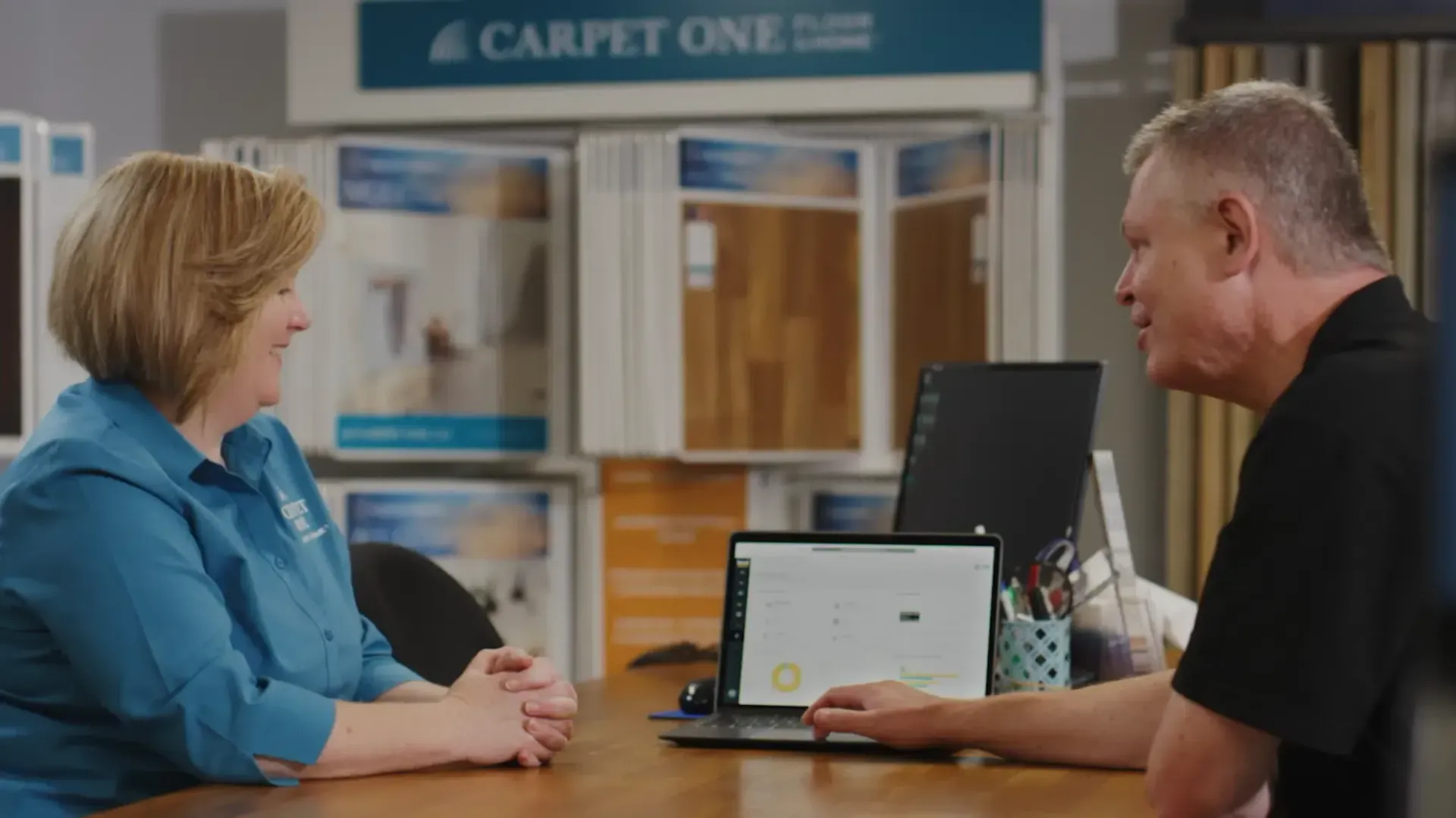
Localsearch looks back on over 30 years, proud of its transformation to a leading marketing solution provider, now launching nationwide with Performance Boost, an AI-driven solution, to empower businesses with affordable and effective local marketing.

We are thrilled to announce the return of Localsearch's Highly Rated Businesses Top 100 list! Discover the ultimate guide for Australian consumers seeking exceptional service providers.

Discover how Localsearch celebrates excellence with its Highly Rated Businesses recognition. Learn about the selection process for the top 100 Australian businesses recognised for their exceptional service and customer satisfaction.

Discover actionable tips for safeguarding your small business against increasingly complex cyber attacks. Take the first step toward protecting your business by downloading our free checklist.

Uncover the impact of the RBA's decision to hold interest rates for Australian small businesses. Learn how the 4.35% rate in 2024 may impact you and find effective financial management navigation strategies.

Is your business up to date with the recent changes to the TGA guidelines? Read more to find out.
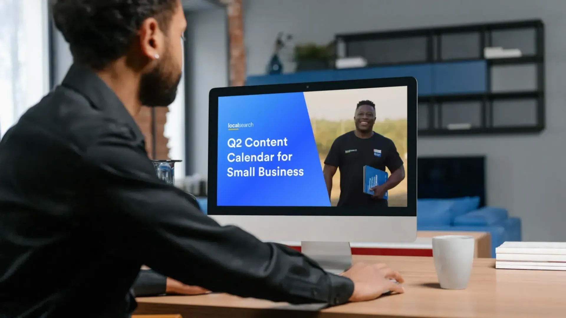
As a business owner, staying ahead of the curve means staying informed. Take advantage of our Free Q2 Content Calendar to ensure you never miss an important date.
Find out everything you need to know about the Easter long weekend as an Australian small business, including how to update your holiday hours and the best places to do this.

Discover essential steps for successful business loan applications! Whether you're a small business owner, seasoned entrepreneur, or startup, maximise your chances of success and fuel your business growth today.