You know those websites that make you cringe the second you enter them? They make you think, “What in the world made you make a website like this?”
Beauty may be in the eye of the beholder, but if the beholder isn’t your customer, you’re going to be losing a big chunk of the profits you could be making.
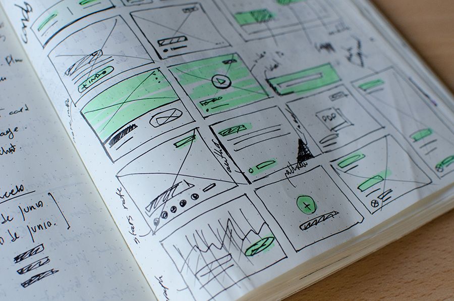
We got together with our head user experience designers to discuss exactly what business should avoid in making a website that doesn’t suck in 2019. Of course, not everyone is a trained website designer or developer, so if you need some help, just give us a buzz.
You may also like: The Dos & Don’ts of Working with an Australian Website Design Service.
Quick note: The websites featured in this article are not ‘bad’. They are simply examples to illustrate.
The Website Mistakes Your Should Avoid in 2019
Sliders
You know those ‘cool’ sliding galleries you’ll often see at the top of homepages? Well, turns out only 1% of users will actually click on a slider, so all the images and content you put into them go unseen. Bummer.
There’s actually science behind this. It turns out, people ignore carousels or sliders due to something called banner blindness. The brain automatically thinks a slider on a website is an ad, causing people’s eyes to just glaze on over them. Not only that, but carousels tend to slow down website and don’t always work on mobile devices, which is a massive no-no for search engine optimisation (SEO).
What should you use instead of a carousel on a website?
Users honestly have no issue with scrolling. We recommend skipping the carousel and simply having a static image. Then, put the information you would of had in the carousel elsewhere on the page.
If you’re concerned about people not scrolling, look into installing a heatmap in your website’s backend (don’t know what this is? Find out here!). A heatmap will let you track where people are tracking and how far they’re scrolling on a page, amongst other things.
Quirky Fonts
If someone has to pause to interpret font, not just read, and do the puppy dog head tilt from side to side, you may want to reconsider your choice. People won’t read everything on a webpage—it’s natural not to do it. You want people to be able to quickly skim through the content and their eyes land on what they’re looking for, whether it be a stat, particular word, etc.
While we’re on the subject of fonts, ensure you use readable colours. Neon pink and yellow may be your favourite colours but they’re pretty strenuous on the old eyes. Claim fame with plain Jane!
What are good fonts to use when you make a website?
To be honest, as long as the characters are easy to define, the size is large and there’s no distracting backgrounds, you’re fine to use whatever you please. Send your chosen font with a few different words to a selection of people to see if they agree it’s pleasing to the eye.
Distracting Backgrounds
Sometimes it’s not the font that’s the problem. Using bright or chaotic backgrounds or photos can make it difficult to read any content or just be plain distracting. Stick to plain colours within your colour scheme, and if you want to use an image, lower the opacity so the text is the focal point.
While we’re on the subject of images, ensure you use clear, high-quality photos only. If it doesn’t make sense to be there, just leave it off or add it to your gallery.
ALL CAPITAL HEADERS
This is interesting. Studies have shown people read all-capped words letter by letter, instead of as a whole. Not only is this frustrating, it slows down the speed of reading.
How should you format headings for a website?
A heading should be in title case without any punctuation at the end (unless a bracket or apostrophe is required). Avoid using exclamation marks and full stops, unless the heading is a full sentence.
Not Having a Footer
When people can’t find what they need at the top of your page, they’ll normally scroll to the bottom to see if it’s in the footer. When you make a website footer, treat it like a sitemap.
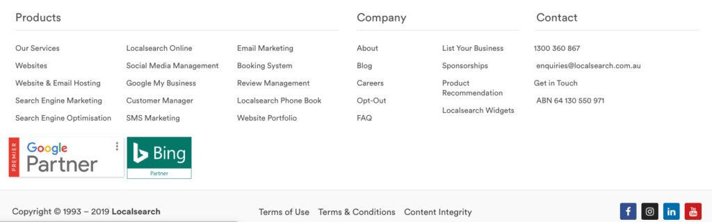
What to include in your website footer:
- Your contact information.
- Links to each product and services page.
- Links to your About, FAQ, Gallery page etc.
- Any terms & conditions, privacy policies, etc.
- Links to your social media accounts.
- Any certifications, award badges, licences, etc.
Unnecessary exclamation marks!
What is an exclamation mark?
An exclamation mark (!) is punctuation used to tell the reader someone has exclaimed, AKA calling out in excitement, anger, pain or emotion.
Unless you’re exclaiming, please limit your use of the exclamation mark. Sure, strategic use of the exclamation mark can evoke excitement or urgency, but again, this is possibly because you’re exclaiming.
Avoiding SEO (Now & In the Future)
Search engine optimisation (SEO) is how you can help ensure your website’s long-term visibility on Google, Bing and other platforms. Yes, it’s tricky and time consuming if you do your own SEO but without it, you may as well not have a website at all.
Things to consider for your SEO:
- Site map structure.
- Page structure, including heading placement.
- Image and content optimisation.
- The use of keywords.
- Your code structure.
- Off-page activities, such as backlinks.
There is plenty more, but we’re sure you’re feeling a little mind-boggled already. If this is you, then please reach out to us. Our Google-certified SEO specialists, website designers and developers, content writers and other digital teams are here to help.
Cover image source: Igor Miske on Unsplash